Lifting the hood on scannability in data visualisation
By making the most important and relevant information easy to find, you’re creating a 47–58%* better user experience. This is where scannability comes into play. It’s all about making the often needlessly complicated world of data reporting simple to understand.
[*Measured usability, Nielsen Norman Group, www.nngroup.com]
According to Microsoft Research, you have under 10 seconds to produce enough value to capture users’ attention.
Data visualisations are a form of visual art that grabs our interest with colour and patterns and keeps our eyes on the message. Data visualisations are not only graphical representations of information though. They are also a great aid in analysing and making data-driven decisions. By virtue of people perceiving visuals faster than words, visualising breaks down big data into smaller chunks of information that’s easier to scan and interpret.
Now there’s a misconception we need to address here, or we’ll be led quickly astray from purposeful design: ‘the best way to visualise the data’.
Wait. How is this not the objective?
Charts never “show the data”, they always just say a few specific things about the data.
— Bryan Pierce, Practical Reporting
When we design a chart for the overall best way to visualise the data, we fall into the rabbit hole of subjectivity. In contrast, the most useful, usable, and engaging data visualisations are constructed to address what specifically we need to say about the data.
Consuming large data sets and then discerning anything useful from them isn’t always straightforward. Extracting insights from data is definitely the ultimate function of data visualisation. They come into their own when information needs to be interpreted immediately.
Yet, data visualisation that truly has an impact is rather about all the things you don’t see — the strategic choices that are made, what we’ve decided to leave out, the data analysis, and evidence-based development out of user experience research.
Data visualisation is a lot more than beautiful visuals; it’s about a thorough understanding of the users and their needs and finding the best way to communicate valuable information.
Your graphs have to be rock solid. They have to stand on their own — they can’t be open to interpretation.
— Courtney Jordan, Towards Data Science
By using the laws and principles of UX design, you can create a balanced understanding of the content and what it means. And by improving UX education for the end users of a report, we can design dashboards that are as easy as possible for stakeholders to understand and interpret.
This means using human language, avoiding too much jargon, and working on the assumption that the end users of your report have minimal knowledge of your analytics. It can be as simple as employing headings and labels that explain exactly what the data is telling us.
For example, ‘Capacity’ can be expanded to ‘When are we straining for resources?’. This makes it absolutely clear what questions are being answered, and what end users should take away from the data.
Every choice made must come down to who your end user is.
— The DataFace
Using UX design principles when creating your analytics reports delivers an improved understanding of what your data means and how it relates to business operations.
It pays to be smart about what data is presented on a page. Large amounts of content can overwhelm the user. When there’s too much for the eyes and mind to process on a single page, it’s a deer-in-headlights moment and the user cannot comprehend any actionable insights or the report holistically. Too much data is just as bad as not enough.
The time it takes to make a decision increases with the number and complexity of choices.
— Hick’s law
The thing is that simplicity adequately conveys information.
The more information you have on a page, the more time it takes the user to read and interpret, the harder it is for them to pull out the key pieces of information, and the less likely they’ll be to remain engaged with the content.
For reports to be scannable, the crucial pieces of information need to be called out in places where the user’s eye will travel. Grouping data sets together in prominent places will make it easier to scan your report and find and decipher the necessary information even when there are multiple metrics to display.
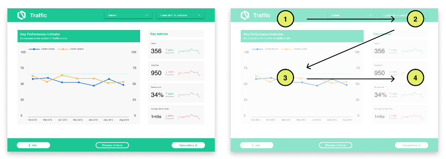
Another example: a ‘Z’ reading pattern sees the user zigzagging down the page from the top left, so the content should be positioned to fall along this pattern.
It is also imperative that you give page elements enough room to breathe and to be seen properly so users don’t miss what they came to find. Having enough white space is essential to helping a reader focus on the copy and visuals.
As users’ eyes skip down the page, white space is one of the most critical elements that helps them do so.
It is now expected that the ways we present data — most commonly, in a report — are parallel with how we read and navigate on the web. And it makes sense. Using the principles of UX design to enhance the visualisation of your analytics provides readers with an easier way to digest the information.
Good design is created out of a care of the users’ journey as much as it is about business or organisational objectives. Improving scannability also improves measurable success rates for the many user tasks and enterprise outcomes the content is being designed to support in the first place.
Highlight the information that will capture the end user’s attention. Sift through the user research to identify what about the data has meaning and will bring actionable insights for the people using the report. This way people can enter complex data without being overwhelmed by the information.
After all, people don’t really read data — they scan.