Search
Close this search box.

How to use the KPI Visual in Power BI

The KPI Visual in Power BI is useful for showing whether a target is being met or not, and to what degree it is meeting or missing that target.

For this visual to be of use, we must have or know a number of things:

  • Indicator – the main value we are measuring
  • Target Goals – a measure or value to compare the main value against
  • Trend Axis – the time period that the results should be show for e.g., days, weeks, months etc
  • Direction – whether high or low is good or bad for this KPI
Select the KPI visual from the visualisation pane.

In this example we are going to compare Orders for the current year versus LY Orders (LY = Last Year), with the trend being shown on a monthly basis. The measures and the column required can be dragged into the KPI visual like with any other PBI visual.

By default this gives us the below view – you can see that the visual is displaying the latest month’s data versus the previous year’s figure.

(Please note that if you are using a text column like month name, you must make sure it is sorted in the correct order like in the example above.)

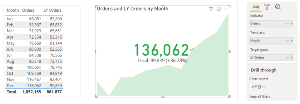
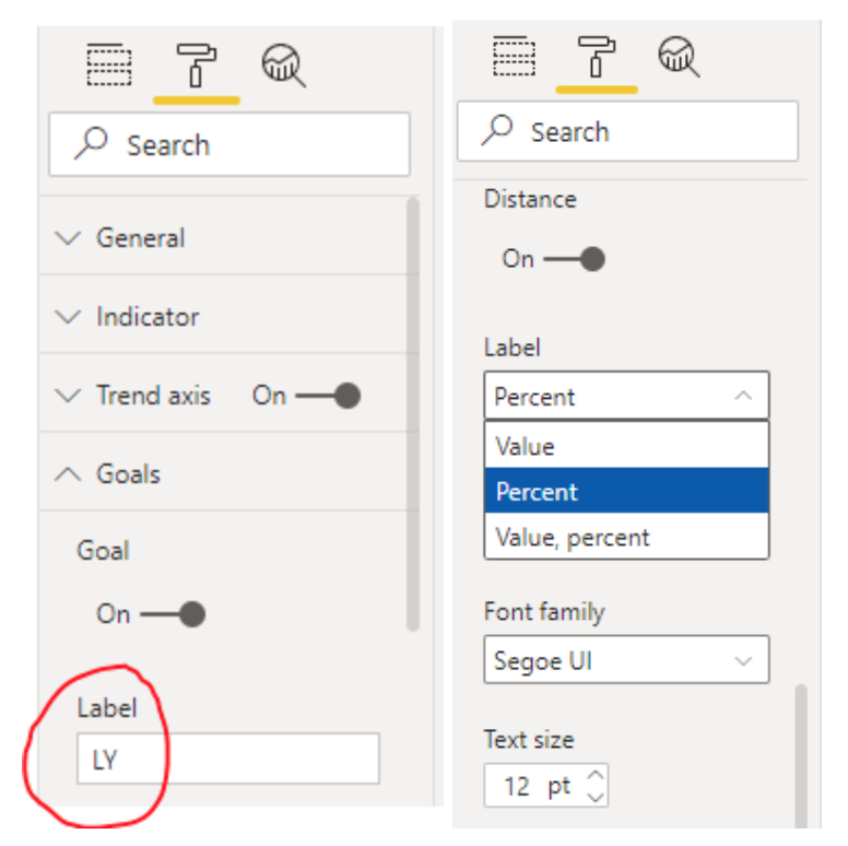
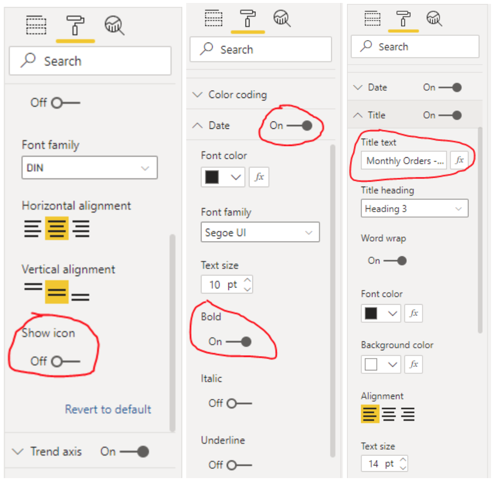
Next, we will edit the Goal details to suit our reporting needs. There are a number of options, including removing the distance label between the value and target.

The direction of the KPI colour coding is a very important part that needs to fit the appropriate business rules for this KPI. In this example, the desired outcome is that Orders are lower than the previous year.

There are a few other things we will go through here to change how the visual looks. The Indicator, Date and Title dropdowns will be looked at.
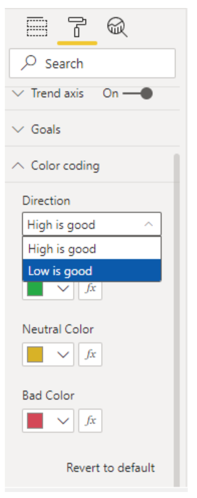
There many other formatting changes that can be made to the visual. Conditional formatting for colours using DAX measures can greatly increase the number of colour options available. Also, many features used here, such as the goal details, trend axis and distance, can be turned off if preferred.

Summary:

The KPI visual is an easy and efficient way to show key information about whether KPIs are meeting their targets or not. It can be used in reports and dashboards and a single glance can tell stakeholders how they are doing and what the underlying KPI trends are.

Share this post:

About The Author