The March 2022 Power BI release is out! These are our top three picks for best new features:
Error Bars
Error Bars is a new feature that allows you to represent uncertainty in your data. This functionality is available in Preview Features and becomes an additional setting for your Line charts. There are a few different ways to represent the error, the default being small vertical lines, but shaded bands will likely be the most used.
The error shown will need to be calculated in a custom measure, which you can define however you wish. If you want to show these upper and lower bounds, they can be added in the tooltip for the line chart. These different ways to visualise any variance in your data are a nice tool to have in your report-making arsenal.

Filter by List Visualisation
If you have a lengthy list of selections to make, this Filter Pane will be a useful alternative to the default filter. It allows you to copy and paste a list of selections you wish to make, and it will automatically apply the filter to each item.
This free filter made by Devscope is a handy quality of life visual to keep in your back pocket. You can find it under Get More Visuals in Power BI.

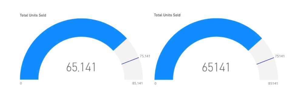
Dynamic Formatting String
This formatting fix is a small but welcome change. Users had reported inconsistent formatting for strings, which you also might have noticed. The inconsistent formatting was affecting gauge visuals and some bar charts, but the latest Power BI update has addressed this issue.
Commas will now properly show on large numbers for your gauge visuals when you have a dynamic formatting. This makes your visuals easier to read and brings them in line with the rest of your report. Here is a comparison of visuals showing the new dynamic formatting.