The second last Power BI release for the year is out, and there have been some big changes, most notably, to the reporting features. Now that we’ve had a chance to look through it, here are the new features that caught our attention.
Page and Bookmark Navigators
This is probably the biggest and most useful change from the latest update. Previously, it had been time consuming to create custom navigation, so this streamlined approach is a welcome change. Now, you only have to set up the navigation one time and then reuse it wherever you need it. This means that if you change a page name or add a page it doesn’t have to be edited everywhere that it appears in the navigation.
To get this in your reports follow Insert > Buttons > Navigator > Page navigator

New Format Pane
The new Format Pane has been added to Preview Features, so it needs to be turned on before you can see this change.
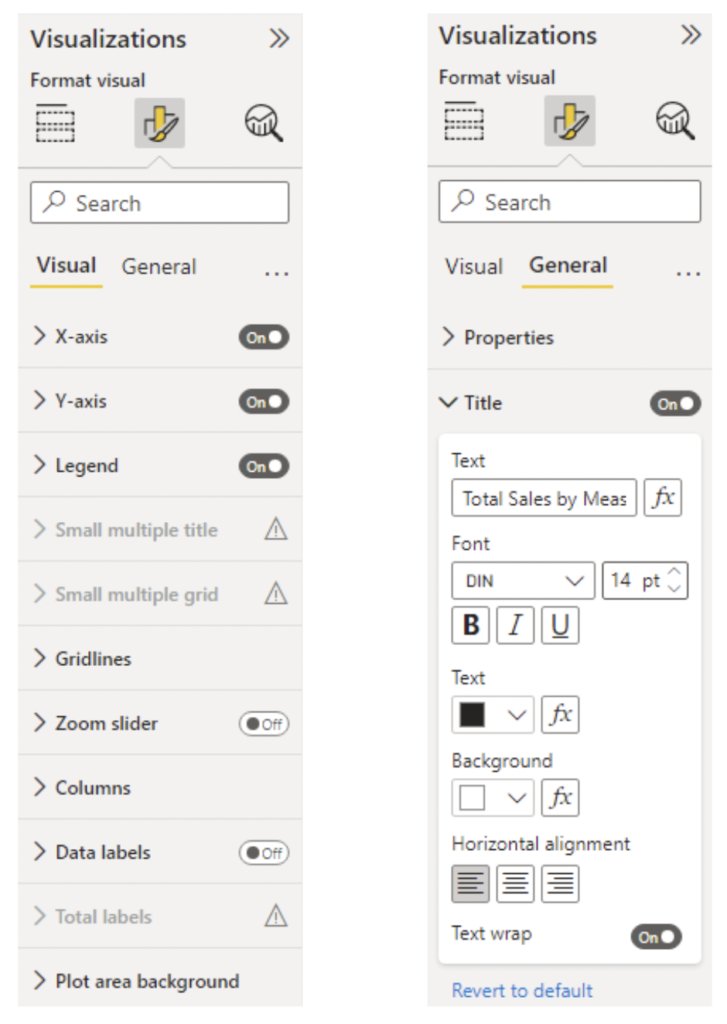
This is a more substantial change to the UI than we have seen for a while. There is now a split between Visual Settings, which are specific to that visual, and General settings such as title and size.
The overall layout of the Format Pane feels more intuitive now and there is also a Revert to default button for when you want to reset the factory settings of the visual. You will also notice that the Visualisation selector pane is only present when the build tab is selected. This makes a lot of sense because you will most often be selecting a visualisation and then adjusting the formatting in that order.

Pie/Donut Chart Rotation
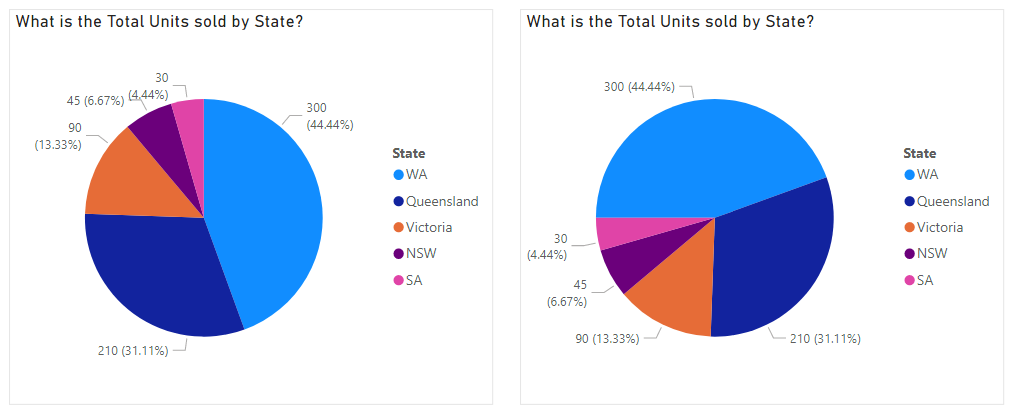
The default layout for a pie chart is to have the largest slice start at 12 o’clock and progress clockwise. This means you often end up with small slices at the top where it is a bit crammed to have data labels. Being able to rotate the chart is a simple fix which makes it easier to fit labels on the pie chart where they are needed. The angle of the pie chart can now be adjusted in the formatting under Rotation.

