The new Power BI release is out, and now that we’ve had a chance to look through it, here are the new features and visuals that caught our attention.
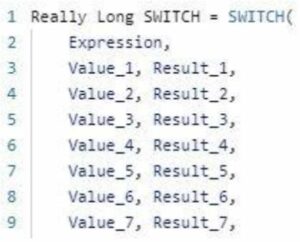
Favourite Feature: SWITCH performance optimizations

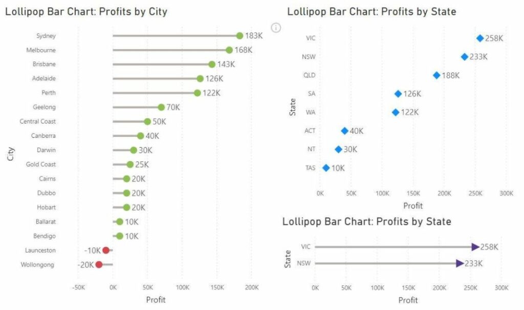
Favourite Visualization: Lollipop Bar Chart by Nova Silva
This new visual from Nova Silva resembles a bar chart but with a tidier look, which is perfect for when you have a larger number of categories. The Lollipop Bar Chart is a good choice for when your traditional bar chart becomes too cluttered. Each category is represented by a line with a small, coloured dot. There are also some nice customizations possible as well, for example, where the lines can be hidden to give a dot plot. Lollipop Bar chart is free in the AppSource so you can get these nice features without paying a cent.
Here are a couple of examples where we’ve used the Lollipop’s custom features.

Learning Power BI: DAX in a day
Dax in a day is a training course which covers the programming language of DAX to a more experienced audience. The Dashboard in a day and Advanced modelling and shaping courses, which DWC are well known for running, are prerequisites for this training.
This looks like a great way for you or your business to delve further into DAX and become more confident defining measures, creating calculated tables and columns, and modifying the filter context, among other things. This course will also touch on the performance and functionality issues, to ensure that we learn to keep our models as simple and efficient as possible, while getting the required result from a DAX formula.
