Uncertainty is part of our lives and it’s not always easy to deal with it, let alone understand. Indeed, the human brain isn’t the best tool when it comes to assessing probabilities.
Let’s look at business projections as an example. Those involve risks, and the solutions that we propose might (and will!) be off — but by how much? And what is the likelihood of those variations happening?
In this post, I’ll fill you in on a relatively easy numeracy work method that will allow you to answer those two questions. Don’t worry, this technique is more accessible than you think, and I’ll outline the procedure step by step.
Too many times have I heard people tell me “Wait, what’s this functionality that you just used in Excel? This is amazing!” Ironically, this is a trick I have used on countless occasions, and every single time, my audience wanted more of it — plus it made my boss look good.
Without any further ado, let’s get started.
To do this, you’ll need a fun business problem (involving uncertainty) to solve, Microsoft Excel, and Power BI.
Business Problem
Ten people have $300 in their possession ($30 each). They participate in an experiment where they all need to roll a die three times and give away an amount that is equal to the sum of their die rolls.
What can be said about the total amount of money available at the end of this experiment?
- If one die roll returns 3.5 on average, 10 people and 3 rolls each will result in an average loss of $105 (3.5 x [10 x 3]).
- The amount available at the end of the experiment should be around $195 ($300 − $105), more or less.
What if the group needs at least $190 to move on to the next phase of the experiment? How often would that happen? That question is a bit more difficult to answer from the top of your head. But, you could probably argue that the answer would be more than 50% of the time. That’s about it.
Let’s find the answer.
Setting Things Up in Excel
The first step is to create a template table to collect the data of a typical experiment.
Table 1 – Template

1. Probability Table (probabilityTbl)
Table 2 – Probabilities
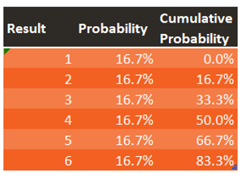
The six possible outcomes of a die roll are expressed in this table. Each of those events have a 1/6 (or 16.7%) probability of happening. A cumulative probability column is created, starting at 0% on the first row, and cumulatively adding the individual probabilities until the last row.
What we’re trying to achieve here is a way to generate a result (“1,” “2,” “3,” “4,” “5,” or “6”) following the probability distribution from this table.
This process can be conceptualised with the following animation:
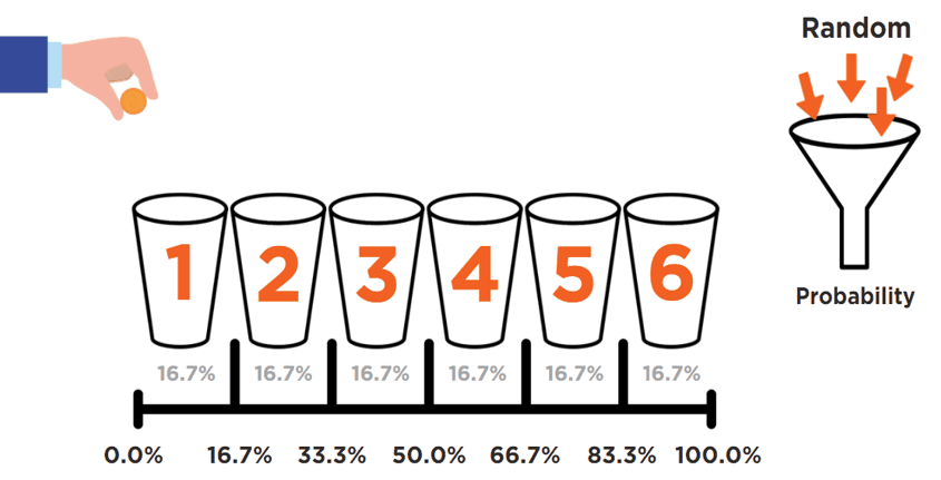
A completely random phenomenon (i.e., an arbitrary drop of a penny) is being harnessed into controlled probabilities (buckets). All buckets’ sizes are defined and directly linked to the probability of collecting that penny.
The two following Excel functions can replicate that concept for us:
2. RAND() = The Moving Hand
This function doesn’t have any parameters.
As described in the Microsoft documentation, the RAND () function returns a random number greater than or equal to 0 and less than 1. When a worksheet is recalculated (by pressing F9), a new random number is generated.
3. XLOOKUP() = The Bucket That Collects the Penny
The parameters of this function are (lookup_value, lookup_array, return_array, [if_not_found], [match_mode], [search_mode]).
This function looks for a lookup_value by searching a lookup_array, and then returns the item corresponding to the first match it finds. If no matches exist, then XLOOKUP can return the closest (approximate) match. The parameter [match_mode] is the key here, and we set it to “−1” so the returned value is an exact match or the next smaller item.
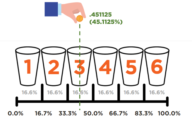
Voilà! You can now virtually roll a die by hitting F9 on your keyboard.
Now that columns (c), (d), and (e) from Table 1 have been populated with the XLOOKUP function above, pressing F9 will actually run the entire experiment. See how the available money updates when the file is refreshed six times:
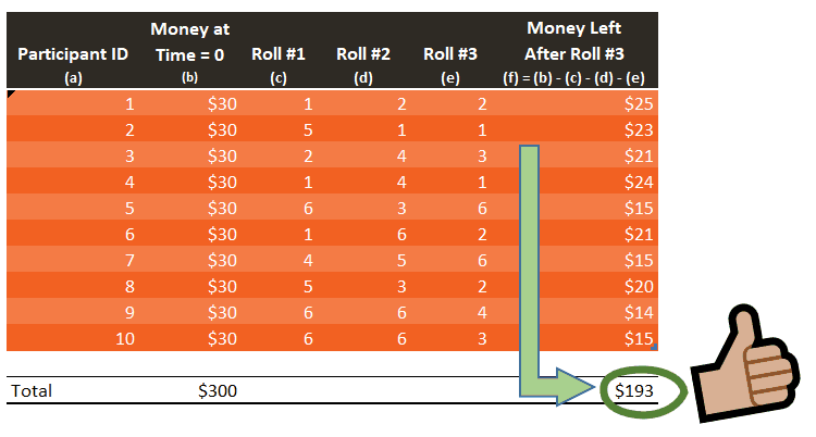
The results generated above appear to be in line with our initial assumption: the amount available at the end of the experiment should be around $195, more or less. Yet, $195 never shows up once. If we run this experiment a large number of times, the average result will tend to get closer to the expected value of $195. So we need to conduct this experiment many times, a lot more than six times. The more data you have, the more credible your results become.
Simulation Party
Now is the moment to talk about this: “Wait, what’s this functionality that you just used in Excel? This is amazing!”
This life-changing tool is called Data Table. It requires a bit of structure, but once you get the hang of it, you’ll be using it all the time. In a nutshell, Data Table allows you to recalculate a result by changing parameters of your choosing. In our case, we’ll only be scratching the surface of Data Table because we’re only recalculating the money left at the end of the experiment. All parameters in that scenario remain the same. We’re only interested in the virtual press of the F9 key.
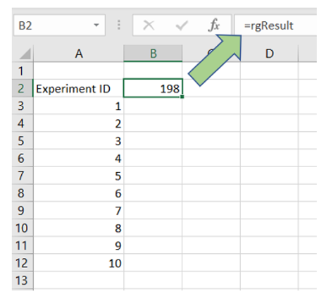
1. In a new Excel sheet, make B2 equal to the result, which needs to be recalculated. In my case, the amount left at the end of the experiment sits in a named range called “rgResult”.
2. Create the “Experiment ID” header in A2.
3. Generate a list of Experiment IDs (one per experiment). Let’s do 10 for now.
You should now have something like this:
You can test this setup by hitting F9 and see if the value in B2 updates as expected.
4. Select the range from A2 to B12.
5. Go to Data menu > What-If Analysis > Data Table.
6. Put cell “A1” as a Column input cell and click OK.
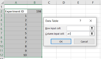
Using A1 as a dummy reference tricks Excel into recalculating the file, which is exactly what we need.
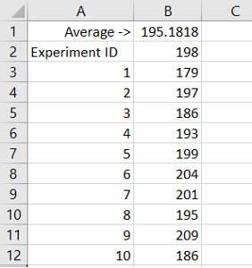
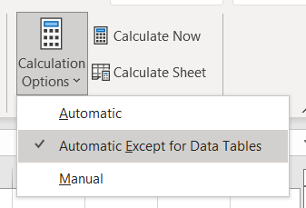
In this case, all values contained in the B3 to B12 range consist of refreshed results from B2. That’s right, Excel recalculates the entire template table in the background to capture the amount of money left at the end of the experiment. How cool is that? Depending on your computer power and how big you decide to make this table, you might want to change your calculation settings:
Visualisation Time with Power BI
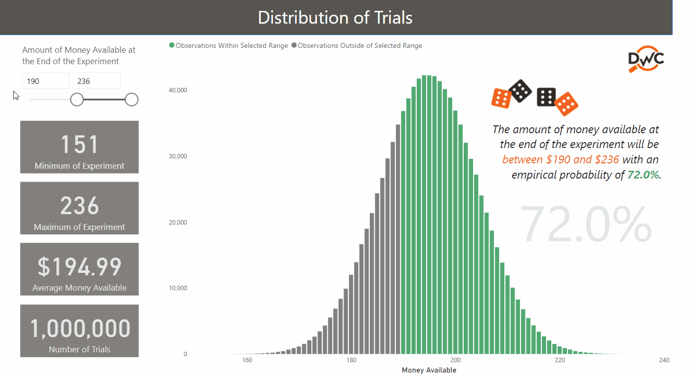
After one million trials, the average money left at the end of the experiment significantly converges with the theoretical amount ($194.99 vs. $195.00). This kind of check will put your audience at ease.
Some people would prefer to not draw attention to the fact that the average result is $194.99 and not $195.00. I would typically adopt the opposite approach and highlight those “issues” to my audience and transform them into “non-issues.” Here are some of the things I would say:
- Simulations are replicating real-life events. With one million simulations, the lowest and highest results are $151 and $236, respectively. In reality, the theoretical minimum and maximum are $120 and $270: that would only happen if 30 “1s” or “6s” were rolled consecutively. Not impossible, but unlikely!
- These scenarios will operate within the boundaries of the assumptions that you gave them. Any unforeseen events won’t be considered. For example, this die-roll model couldn’t predict the situation of a participant stepping down from the experiment without a formal assumption.
You increase your chances of getting better engagement and buy-in from a non-technical audience if things are approached the right way.
If your true goal is to educate and enable your audience, avoiding technical jargon is probably a good tactic. The opposite might give the impression that you know stuff, but really, no one wants to discuss Monte Carlo simulations, binomial probability functions, normal approximations, law of large numbers, confidence intervals, etc.
This post talked about a great trick to visualise uncertainty of your business assumptions. The die-roll experiment is quite simple, but hopefully, it will inspire you to develop this logic for real-life problems you want to solve, such as the following:
- How many employees (and when) will the HR team need to hire next year if we expect a turnover of 10% and a growth of 30%?
- How much money will we lose next year due to client lapsing?
- What will be our new product’s profit margin for the next quarter?
Data can be intimidating, and there are ways to make it accessible and fun.