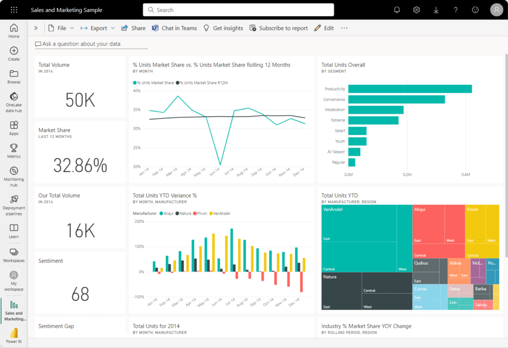
Creating dashboards that communicate data effectively is one of the most powerful aspects of Power BI. When you create Power BI dashboards, you transform raw data into actionable insights, enabling your team to make informed decisions and uncover trends. Whether you’re a beginner or an experienced user, learning how to create dashboards that are both functional and visually engaging is essential for maximizing the platform’s potential.
This guide explores the steps and best practices to help you create Power BI dashboards, from designing impactful visuals to sharing your dashboards with others.

Why Create Power BI Dashboards?
Power BI dashboards are essential for businesses aiming to make sense of their data quickly. Unlike static reports, dashboards are dynamic, offering a centralized hub for presenting key metrics, applying filters, and drilling into detailed insights. A well-designed dashboard brings together data from multiple sources into a single, user-friendly interface.
The process to create Power BI dashboards requires careful planning, thoughtful design, and strategic sharing to ensure they provide maximum value. Whether tracking sales performance, monitoring operations, or presenting executive summaries, dashboards enable businesses to turn data into decisions.
Best Practices for Creating Power BI Dashboards
To create Power BI dashboards that resonate with users, it’s crucial to follow design principles that prioritize clarity, usability, and relevance. Here are some key practices to keep in mind:
Focus on Key Metrics
Start by identifying the main questions your dashboard should answer. Include only the most relevant metrics to avoid clutter and confusion. Highlight critical data points prominently, ensuring users can quickly interpret the most important insights.
Choose the Right Visuals
Visualizations are at the heart of every dashboard. When you create Power BI dashboards, ensure that each chart or graph serves a specific purpose:
- Use line charts to track trends over time.
- Leverage bar charts for comparisons across categories.
- Incorporate slicers and filters to let users explore data interactively.
Simplify the Layout
A clean, well-structured dashboard enhances usability. Organize visuals into logical sections and use white space to separate different areas. This approach makes the dashboard easier to navigate and understand.
Use Consistent Formatting
Consistency in design improves the dashboard’s readability. Stick to a uniform color scheme, font style, and visual alignment throughout the dashboard. For example, use similar colors for related data points to reinforce their connection.
Steps to Create Power BI Dashboards
Here’s a step-by-step guide to help you create Power BI dashboards that deliver impact:
Step 1: Prepare Your Data
The foundation of a great dashboard is clean, well-organized data. Use Power Query to transform raw data, removing duplicates and irrelevant rows. Consolidate data from multiple sources such as Excel, SQL, or cloud services for a comprehensive view.
Step 2: Build a Report in Power BI Desktop
Start by creating a report in Power BI Desktop. Use its drag-and-drop functionality to design visuals that align with your dashboard’s purpose. Ensure each visual contributes to the overall story you want your dashboard to tell.
Step 3: Publish to Power BI Service
Once your report is complete, publish it to the Power BI Service. This step enables sharing and collaboration, ensuring your dashboard is accessible to the right audience.
Step 4: Assemble Your Dashboard
In Power BI Service, create a dashboard by pinning visuals, or “tiles,” from your published reports. Arrange these tiles thoughtfully, placing the most critical insights at the top or center of the dashboard.
Step 5: Add Interactivity
Enhance your dashboard’s usability by adding slicers, filters, and drill-throughs. These features allow users to customize their view and explore the data on their terms.
Why Sharing Power BI Dashboards Is Crucial
Sharing dashboards effectively is as important as creating them. Power BI Service makes it simple to share dashboards securely, ensuring your team can collaborate and access insights anytime, anywhere. Assign role-based permissions to control who can view or edit the dashboard, keeping sensitive data protected.
Additionally, use shared workspaces to foster teamwork and encourage feedback. Regularly update your dashboards to reflect new data or changing business needs.
Enhancing Your Dashboards Over Time
Creating a Power BI dashboard is not a one-time task. Regularly review how users interact with your dashboard to identify areas for improvement. Power BI’s usage metrics provide valuable insights into which visuals are most engaging and what filters are frequently used.
Refine your dashboard design based on feedback and evolving business goals. This iterative approach ensures that your dashboards remain relevant and effective in delivering insights.
Conclusion
When you create Power BI dashboards thoughtfully, you unlock the true potential of your data. By focusing on clarity, usability, and interactivity, you can design dashboards that empower your team to make smarter, faster decisions. Sharing these dashboards through Power BI Service ensures insights reach the right audience securely and efficiently.
Ready to create Power BI dashboards that transform your business? Contact us today for expert guidance and support.
