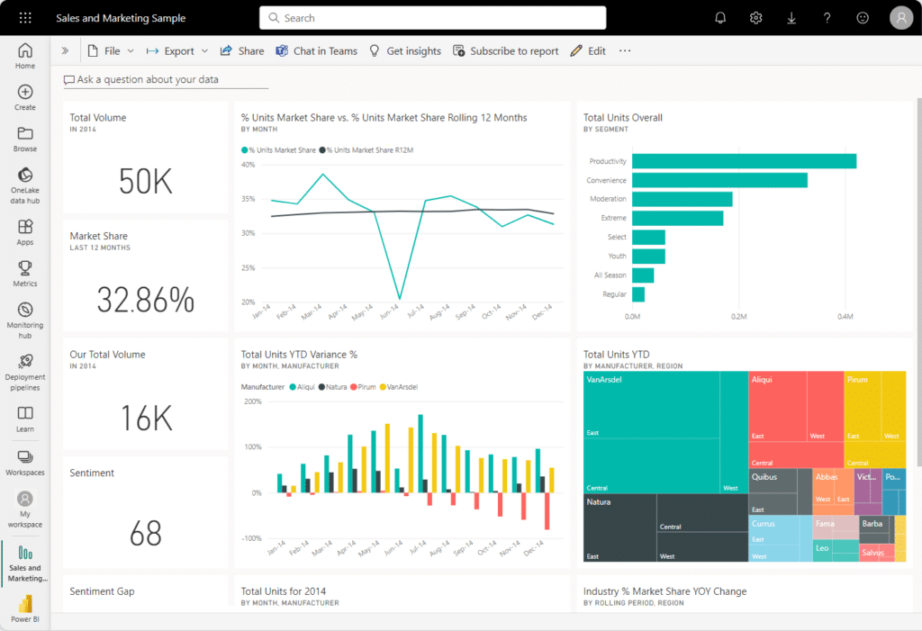
In today’s data-driven world, dashboards are more than just visualizations—they are powerful tools that communicate insights and drive decisions. Power BI dashboards offer a unique platform to present complex data in an interactive, digestible, and impactful way. However, crafting a dashboard that truly resonates with its audience requires careful design and thoughtful planning.
In this guide, we’ll explore best practices and tips for designing Power BI dashboards that not only look stunning but also deliver value by providing actionable insights.

Understand Your Audience and Objectives
The foundation of any effective Power BI dashboard begins with understanding its purpose. Ask yourself: Who will use this dashboard? What decisions will it inform? For example, an executive dashboard might need high-level KPIs and trends, while an operations dashboard requires detailed data for daily monitoring.
Once you know your audience and objectives, design with their needs in mind. Tailor the visuals, level of detail, and layout to ensure the dashboard aligns with their expectations and usage.
Focus on Simplicity and Clarity
A common mistake in dashboard design is trying to include too much information. While Power BI dashboards allow for interactive exploration, cluttered visuals can overwhelm users. Keep the design clean and focused by prioritizing key metrics and avoiding unnecessary charts or text.
Use white space effectively to separate sections and guide the viewer’s eye to the most important insights. Remember, simplicity is the ultimate sophistication.
Choose the Right Visuals for Your Data
Selecting the appropriate visualization for each data point is critical for effective storytelling. Here are some best practices for common scenarios:
- Use bar or column charts to compare categories or track trends over time.
- Opt for pie or donut charts sparingly, as they can be difficult to interpret when there are many segments.
- Choose line charts for showing continuous data, such as sales trends over months.
- Leverage heatmaps or color-coded tables for dense datasets that require patterns to stand out.
Power BI dashboards offer a wide range of visuals—experiment and test to find what works best for your audience.
Leverage Interactivity for Deeper Insights
One of the most powerful features of Power BI dashboards is their interactivity. Features like slicers, filters, and drill-throughs allow users to explore the data and uncover insights relevant to their specific needs.
Incorporate slicers to let users focus on particular time periods, regions, or categories. Use drill-through functionality to enable deeper exploration of specific data points without cluttering the main dashboard. These interactive elements keep the dashboard dynamic and engaging.
Maintain Consistent Design Elements
Consistency in design ensures your dashboard is not only visually appealing but also easier to navigate. Stick to a cohesive color scheme that aligns with your organization’s branding or the dashboard’s purpose. For instance, use cool colors for financial data and warm colors for operational metrics.
Pay attention to font styles and sizes to maintain readability. Avoid mixing too many font types, and ensure labels and headings are easy to read on all devices.
Highlight Key Metrics and Insights
Every dashboard has a story to tell. Make sure your Power BI dashboard tells it effectively by emphasizing the most critical metrics. Use visual cues like bold fonts, colors, or shapes to draw attention to important KPIs.
Place high-priority insights at the top or center of the dashboard, as this is where users’ eyes naturally focus first. Ensure these key metrics are clear, concise, and easy to interpret at a glance.
Test Your Dashboard for Usability
Once your dashboard is complete, test it thoroughly. Share it with a small group of users and gather feedback on its functionality, design, and usability. Look for areas where users might struggle to find information or interpret the data.
Optimize your Power BI dashboard based on this feedback. Iterative improvements ensure the final product is both visually stunning and highly functional.
Keep Performance in Mind
A beautiful dashboard is ineffective if it takes too long to load or refresh. Optimize your Power BI dashboard’s performance by limiting the number of visuals, reducing the complexity of data queries, and aggregating data where possible.
Using smaller datasets or summarizing data before loading it into Power BI can significantly enhance performance without compromising the insights provided.
Stay Updated with Trends and Features
The Power BI ecosystem evolves constantly, with regular updates introducing new visuals, features, and design capabilities. Stay informed about the latest enhancements and incorporate them into your dashboards to keep them fresh and modern.
Consider exploring custom visuals from the Power BI marketplace to add unique elements that align with your audience’s needs.
Conclusion
Designing impactful Power BI dashboards requires more than technical skills—it demands creativity, empathy for the user, and a clear focus on the message you want to convey. By following these best practices, you can create dashboards that not only look stunning but also empower your audience with actionable insights.
Ready to elevate your dashboard design skills? Dive into Power BI and start transforming data into powerful stories that drive decisions. For expert guidance or personalized training, contact us today!
